


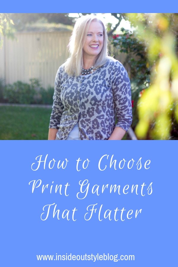
Many women shy away from prints as they’ve read or been told that all prints make you look larger and are generally unflattering. Yet this is not true for all prints and patterns, in fact, many can be really wonderfully camouflaging if you know how to choose ones that flatter you.

There are dimensions to print and pattern that need to be understood to make flattering choices when choosing garments. Let’s take a look at what these are.
Sparse vs Dense Prints
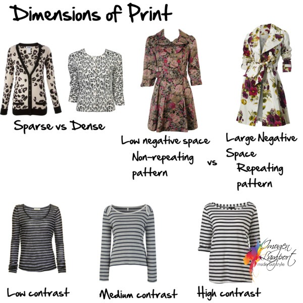
Sparse prints have space (also called negative space) between the print. The negative space can allow the eye to rest between the print and draws attention to that part of the body. Sparse prints tend to be less flattering to more curvalicious bodies, than dense prints, with low negative space, which confuse the eye and don’t let it rest on a particular piece of print.
So choose a more dense print of you’re wearing it on a part of your body that you’d prefer to camouflage.
Repeating Patterns
A repeating pattern is one where each piece is the same and spaced evenly over the garment, it will create focal points. A non-repeating pattern is more distracting to the eye.
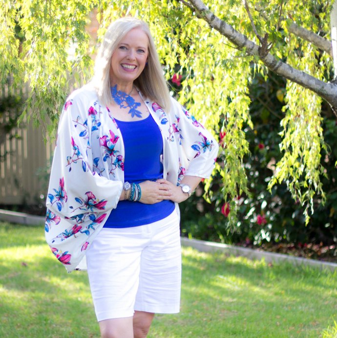
This is a repeating pattern that is quite sparse – as it’s in a fluid, draped garment you don’t notice the negative space so it’s easier to wear. Plus I’m wearing more of it on my back than front!
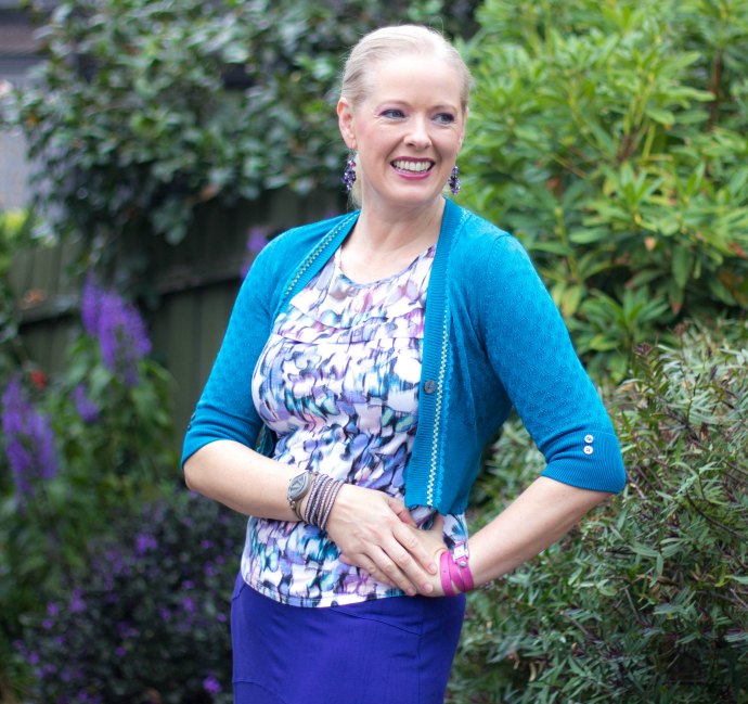
This butterfly print top is a more dense print and so there is nowhere for the eye to rest and focus upon.
The Contrast of the Pattern
The difference in light and dark colours in a print can make a print look smaller or larger (see examples in the image at the top of the page). A low contrast print is more restful and doesn’t draw attention to itself as compared to a high contrast print. A medium scale pattern appears larger and more obvious, the higher the contrast. It will also appear smaller and less obvious when in a lower contrast.
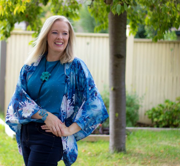
This kimono outfit is lower in contrast than the one above and as the print is blended and doesn’t have a repeating pattern it’s easier sort of print to wear if you want to draw less attention.
Choosing the right contrast will depend on your own colour and value contrasts too.
Scale of the Print or Pattern
The scale of the print or pattern also influences how it appears. In general, choose a print in a similar scale to your overall body scale. So if you’re petite, then a small scale suits, if you’re tall, a large scale works, and otherwise, for everyone else, go for a medium scale print.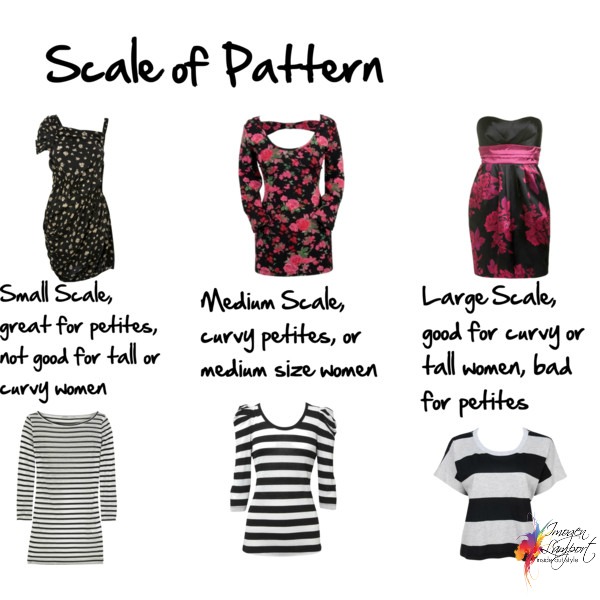
What is interesting, is that the higher the contrast of a print, the larger it appears (as you could see in the image at the top of the page), so a medium scale woman can happily wear a lower contrast large scale print as it’s less obvious, or wear a higher contrast small scale print.
These are a few elements of prints that are worth considering when choosing a garment. Of course, the most important thing to consider is – do you love the print? Does it fill your heart with joy? Does it reflect your personality? Does it make you smile?
More Tips on Choosing Prints and Patterns
How to Interpret and Choose Prints and Patterns For Your Personality
7 Things You Must Consider When Choosing a Flattering Floral Print for You


I am always tempted by sparse prints. I find dense ones to be too much. That said, I know I am better in a dense print. Why oh why are we attracted to what doesn't suit us???? Not fair!;-(
xo+pbc
Fascinating stuff, Imogen! I've always wondered why sparse, irregular prints can be so wonky-looking on a body.
As always a useful and informative post Imogen. I love looking at your polyvores- you seem to be a marvellous teacher. Thanks. Maureen
LOVE THIS POST!! Choosing flattering prints and especially mixing prints is the hardest part for me to achieve successfully. I love the look of certain mixed prints, but don't always manage it successfully on my own. And I want prints to flatter – not make me look like a walking carpet. THANK YOU!!
PS- The purse organizer I won arrived in the mail yesterday. Thank you so much!
This is very helpful, and thanks to your guidance I'm slowly overcoming my "print-a-phobia!"
Thanks a lot this is very wise! I love combined prints on the same piece. It gets very baroque. I was very impressed by the post you made last year on prints and necklaces,the way you so successfully related their shapes. I was wondering if you also had great knowledge to share about prints(colour and shapes) in relation to hair or face shape. How to relate them? You already talked about it in a way. Are there some successfull or fatal combinations?